- DATE:
- AUTHOR:
- Dutchie Product Team
Dutchie E-Commerce: Mobile app redesign, new enterprise tools for chains, smarter storefront controls, fixes, and more
Here’s what’s new in Dutchie E-Commerce
Mobile App Redesign
Dutchie's white-label mobile app is getting a top-to-bottom redesign. This redesign is rolling out gradually; some features listed below are now live and some are coming soon. If your app doesn't have a "Live" feature yet, check with your Dutchie account team on your rollout timing.
Navigation & layout
The overall structure of the app has been simplified, with less chrome on screen and navigation consolidated into the bottom tab bar.
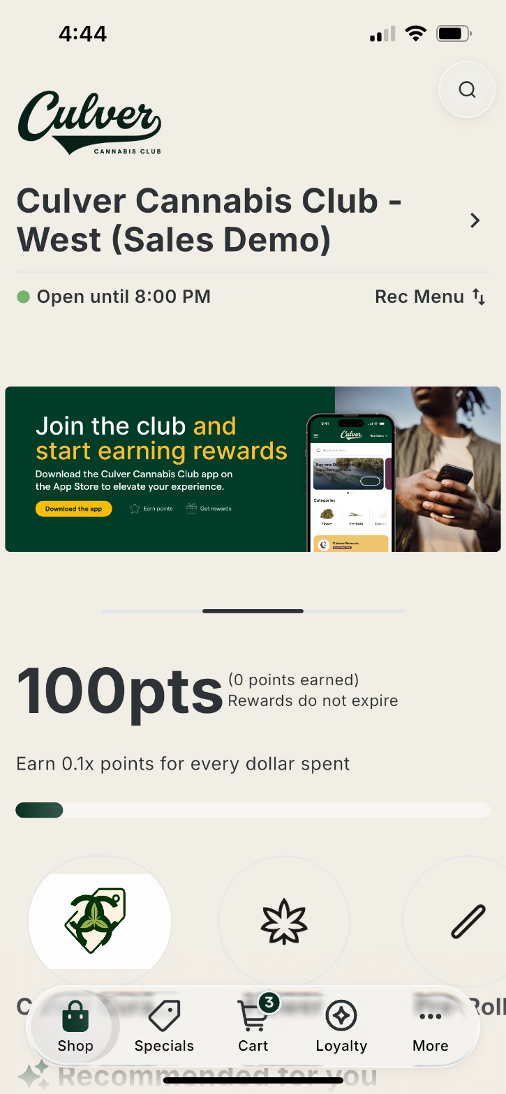
No more title bar (Live)
Every screen in the app used to have a persistent title bar at the top. It's been removed across the board (iOS and Android), giving each screen more breathing room for your branding, banners, and products.
Shorter, icon-only tab bar (Live)
The bottom tab bar is now more compact — its height has been reduced and the text labels under each icon have been removed, leaving just clean iconography for Shop, Cart, Rewards, and More.
"More" tab replaces the hamburger menu (Live)
The hamburger menu (☰) is gone. In its place, a More tab lives permanently in the bottom tab bar. Tapping it opens quick-access tiles for My Account, Order History, Notifications, and Store Info, plus any custom links you've configured (e.g. "Sign Up For 420 Club," "Shop Our New Products"). This makes everything that used to be hidden behind the hamburger menu easier to find.
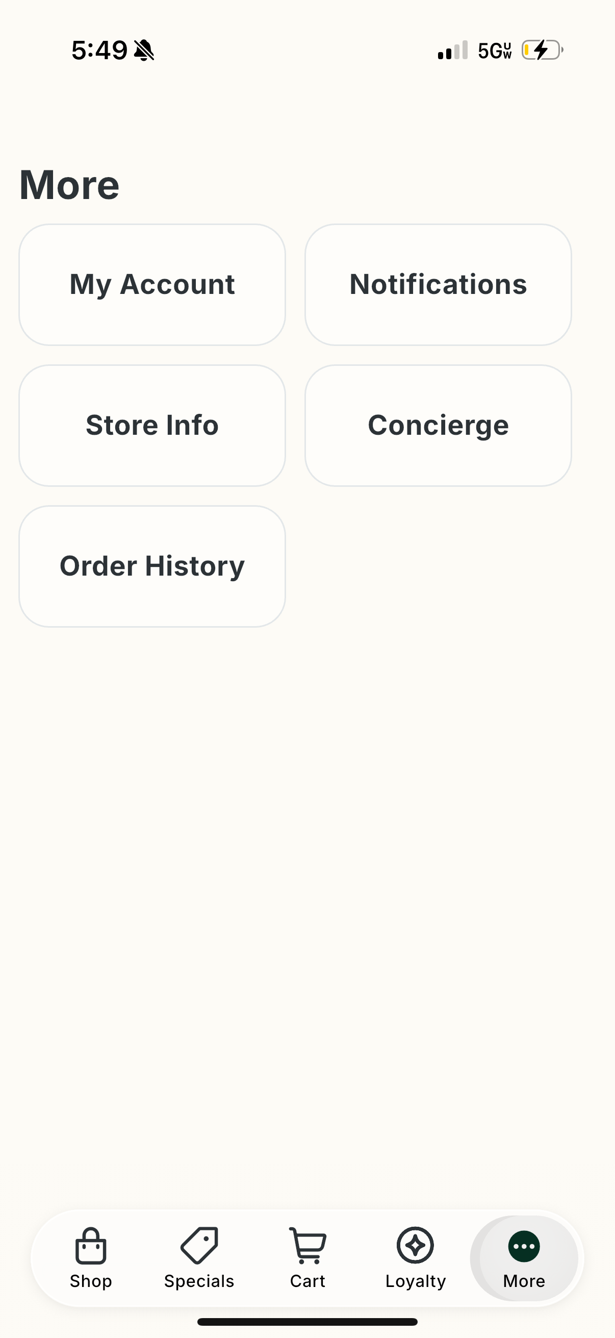
We also fixed several rendering and navigation bugs that came up in the More screen during the redesign rollout (broken links, layout glitches) — those are resolved.
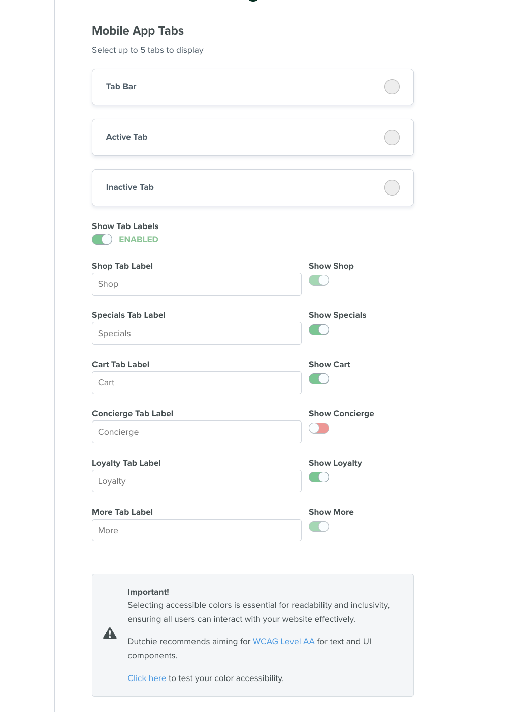
Customizable tabs (Live)
Retailers can now customize which tabs appear in the bottom navigation bar and in what order they're arranged. Changes are configured by your Dutchie team and persist for all customers using the app.
Liquid Glass nav bar for iOS (Live)
On iOS, the navigation bar now uses Apple's "Liquid Glass" frosted, translucent design language (introduced in iOS 26). It gracefully falls back to the standard look on older iOS versions and is not applicable on Android.
Liquid Glass action buttons for iOS (Coming soon)
Screen action buttons are getting the same frosted-glass treatment as the nav bar on iOS, using Apple's glass icon button styling. Android keeps the existing button style, and accessibility behavior (screen reader labels, tap targets) is preserved either way. This is still in code review and not yet released.
Customizable background and loading indicator sytle
Customize the background color of the app and the loading indicator style (similarly Curved, Wavy, Jagged, and Angled).
Customize of the homepage sections with decoration above and below
Options are Curved, Wavy, Jagged, and Angled. Decorations can also apply as a background on the product description pages.
Home screen
Dispensary info up front (Live)
Your dispensary's logo, name, open/closed status, and a Rec/Med menu toggle now sit right at the top of the home screen, followed by the customer's loyalty tier card. Customers no longer have to dig through a menu to find your store hours or switch between recreational and medical menus.
Custom homepage image (Live)
You can now upload a custom image to feature on the homepage instead of the default banner. If no custom image is set, the app falls back to Dutchie's default homepage art.
New product display layouts (Live)
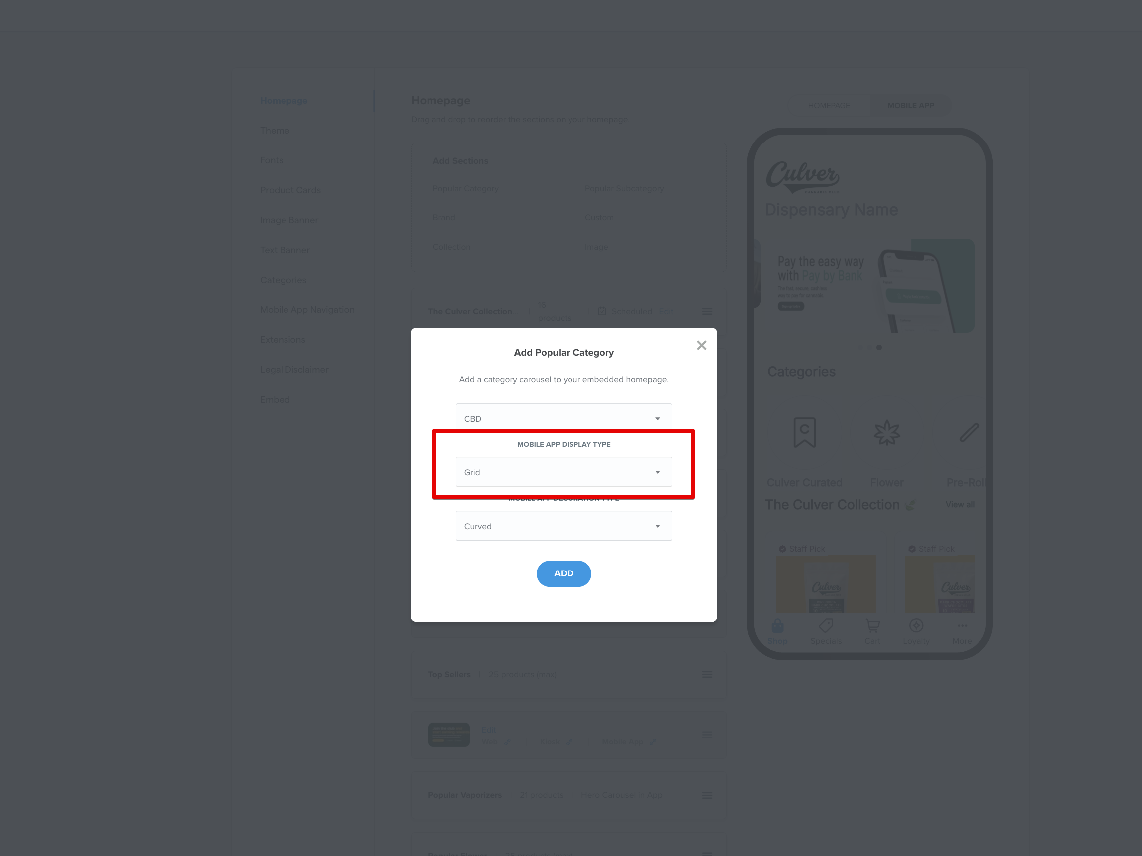
In the Ecomm Admin, you can now choose how each homepage product section renders on mobile. Go to Dispensary Admin > Customize > Homepage, then add or edit a section and pick a Mobile App Display Type from the dropdown:
Scrollable Row (default) — a horizontally-scrolling row of product cards, the classic "swipe sideways" carousel.
Grid — a standard multi-column grid, like a mini product listing page embedded right on the home screen.
Hero Carousel — a large, full-width auto-rotating carousel meant for featured or promotional sections, showing fewer products much bigger.
This applies per section, so you can mix and match layouts to highlight what matters most — for example, a Hero Carousel for a featured Brand section and a Grid for a Category section. The dropdown only appears if your dispensary has a mobile app and the redesign is enabled on your account.
Currently supported section types: Brand, Category, and Custom sections. Not yet supported: Collection sections (no display type control yet), and dynamic/preset sections like Offers, Specials, Staff Picks, Top Sellers, and Recently Viewed (these aren't editable from this screen at all yet).
Cleaner pinned subcategories (Live)
Pinned subcategories that have no products (or have been removed) no longer show up as empty, broken-looking placeholders on the home screen — they're simply hidden until there's something to show.
Browsing & product discovery
Three product card sizes (Live)
Product cards can now render in three sizes — small (dense grid, more products per screen), medium (standard), and large (featured, more visual emphasis). All three show the product image, name, price, and key details, just scaled differently.
Your own card display preference (Live)
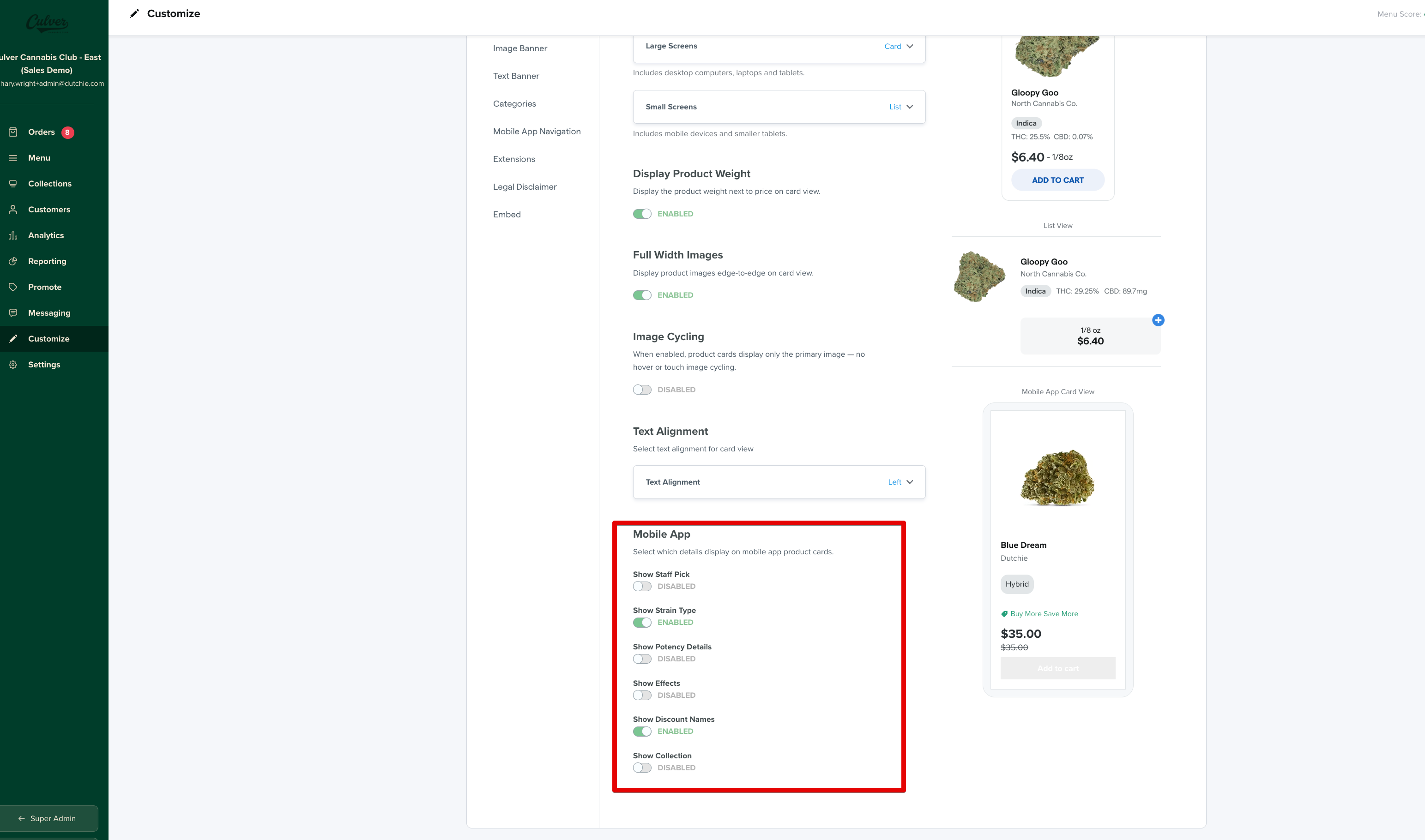
Shoppers can choose how product cards are displayed (grid vs. list, card size, which fields are visible). That preference is saved and applies immediately and persists across sessions, so it's remembered the next time they shop.
Combined sort & filter (Live)
Sort and filter controls used to be two separate UI elements on the products screen. They've now been merged into a single, unified control, simplifying how customers refine what they're browsing.
Grid view on filtered products (Live)
The filtered products screen has moved from a list layout to a responsive grid layout — a more standard, scannable e-commerce browsing pattern.
Search at the top of the product list (Live)
A search bar now sits at the top of the Product Listing Page (PLP), so shoppers can search within the current category or context without leaving the page they're on.
Decorative "flair" on product list pages for iOS (Coming soon)
A new configurable decorative underline/accent ("flair") can appear beneath screen titles on product list pages, giving sections more visual personality. It's controlled by a new screen-title flair setting, with a super-admin toggle to choose the flair style. iOS only for now, with Android falling back to the standard look. There's a related ticket to add visual previews of each flair style inside Dutchie's internal admin tooling, so the team can see options before applying them. Still in development — not yet released to customers.
Specials & deals
Discount badges (Live)
Products on sale now show a prominent discount badge right on the product card — for example, "40% off" — along with "limited time deal" style labeling where applicable. Shoppers can spot deals while browsing, without needing to open each product.
Specials tab fixes (Live)
The redesigned Specials tab had a regression where some specials displayed incorrectly and links didn't always go to the right place — both issues are now fixed.
Loyalty & rewards
New loyalty cards & dedicated Rewards page (Live)
The loyalty card design has been refreshed, and there's now a dedicated Rewards page where customers can view their point balance, see available rewards/redemptions, and refer friends — copying a referral link or showing a QR code — earning points when a friend places their first order.
Loyalty activity feed (Live)
The loyalty page now includes an activity feed showing points earned, points redeemed, and other transaction details in reverse chronological order, so customers can see exactly how their balance changed over time. If there's no activity yet, it shows a clean empty state instead of looking broken.
Live Activity widget (Coming soon)
A planned Live Activity widget (iOS/Android) will show real-time order status updates outside the app. This is designed but not yet built — there's nothing to show customers yet.
Notifications (Live)
Customers can now view a history of previously received push notifications in one place — a notifications inbox listed in reverse chronological order with timestamp and content for each. Previously, once a push notification disappeared, it was gone for good.
Products on sale now show a prominent discount badge right on the product card — for example, "40% off" — along with "limited time deal" style labeling where applicable. Shoppers can spot deals while browsing, without needing to open each product.
Specials tab fixes (Live)
The redesigned Specials tab had a regression where some specials displayed incorrectly and links didn't always go to the right place — both issues are now fixed.
Loyalty & rewards
New loyalty cards & dedicated Rewards page (Live)
The loyalty card design has been refreshed, and there's now a dedicated Rewards page where customers can view their point balance, see available rewards/redemptions, and refer friends — copying a referral link or showing a QR code — earning points when a friend places their first order.
Loyalty activity feed (Coming soon)
The loyalty page now includes an activity feed showing points earned, points redeemed, and other transaction details in reverse chronological order, so customers can see exactly how their balance changed over time. If there's no activity yet, it shows a clean empty state instead of looking broken.
Live Activity widget (Coming soon)
A planned Live Activity widget (iOS/Android) will show real-time order status updates outside the app. This is designed but not yet built — there's nothing to show customers yet.Enhancements
Buy It Again carousel updates
The Buy It Again carousel has a refreshed design that makes it easier for shoppers to find and reorder previously purchased products. A new reorder prompt and simplified product tiles help returning customers move through repeat purchases faster. Learn more in the Help Center.
Enterprise Asset Library
The Enterprise Asset Library gives enterprise teams a centralized place to organize and manage reusable brand assets for e-commerce content. This helps teams keep imagery consistent across locations and reduces the need to upload the same assets repeatedly. Learn more in the Help Center.
Hide special duration on Specials Page cards
Dispensaries can now hide the "N days left" countdown and "Ending soon!" badge on Specials Page cards. A new Special Duration toggle in Dispensary Admin (Promote > Specials Page > Special Cards) lets you turn off duration stamps across the Specials Page, category specials pages, and specials carousels. This is especially useful for recurring or long-running promotions where a countdown may not accurately reflect the deal's availability. The toggle is on by default, preserving existing behavior.
Compare and copy settings across locations
Admins can now copy an entire settings page to other locations in a single action. This makes it faster to apply consistent settings across a chain and reduces the need to update each setting individually. Learn more in the Help Center.
Bulk create users (Chain admins only)
If you manage a chain with several locations, you can create a batch of new dispensary user accounts in one pass by uploading a CSV instead of adding each person one at a time. Each row in the file describes one new user: their contact info, their role, which location(s) they need access to, and which features they can use. Learn more in the Help Center.
Reservation-slot publishing warning
Admins will now see a warning before publishing reservation-slot settings changes that could leave existing scheduled orders without a matching time slot. This helps teams avoid unintentionally disrupting scheduled pickup or delivery orders when updating availability.
Hide unavailable delivery days
The new Hide Unavailable Days setting removes delivery dates with no open time slots from the consumer-facing calendar, helping shoppers quickly find available delivery windows and creating a cleaner storefront experience for limited delivery schedules. Learn more in the Help Center.
Fixes
Updated admin permissions so users with manager-level access have the appropriate access to order management tools without unintended access to unrelated chain-level areas.
Resolved an issue where some e-commerce orders could appear under the wrong customer profile. Orders will now be associated with the correct shopper profile more reliably.
Updated loyalty-related legal language for Ohio menus to better align with state-specific requirements and customer expectations.
Resolved an issue where the Orders permission could allow access to additional chain-level areas such as Analytics, Assets, and Marketing. Permissions now more accurately reflect the intended access level.
The Save button now appears correctly in the custom carousel editing modal, allowing admins to save storefront carousel updates as expected.
Resolved an issue where users with only the Orders permission could access additional chain-level areas, including Analytics, Assets, and Marketing.
Resolved a visual issue in Kiosk Pro that affected how the customer-facing ordering experience displayed at certain locations.